Villegiardini,
renewing a long publishing tradition
The historic magazine on quality living in the Italian style gets an update, adapting to the times.
READ MORE →
Foreword
The magazine has to cope with the crisis of print publications, reformulating its graphic design to widen the readership target.
Project
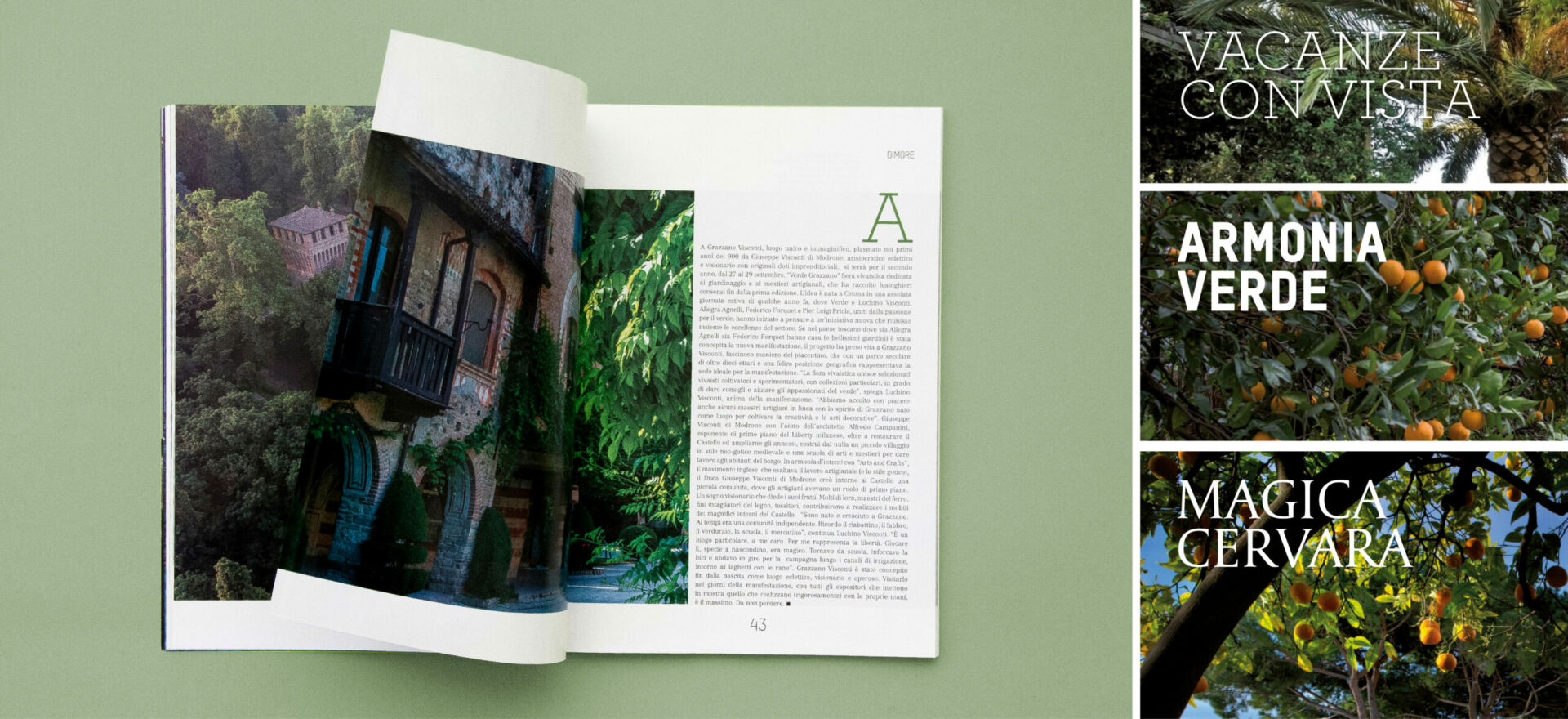
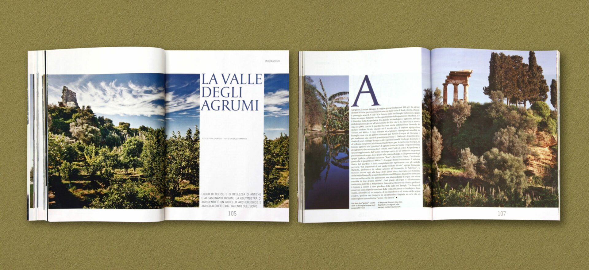
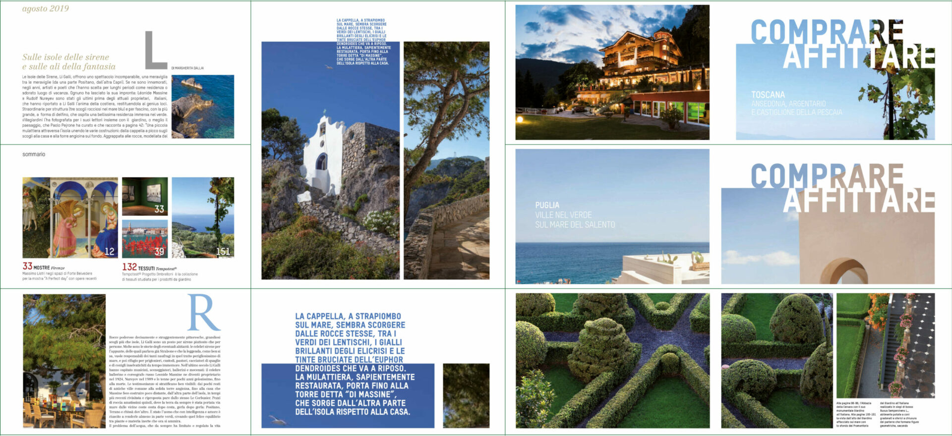
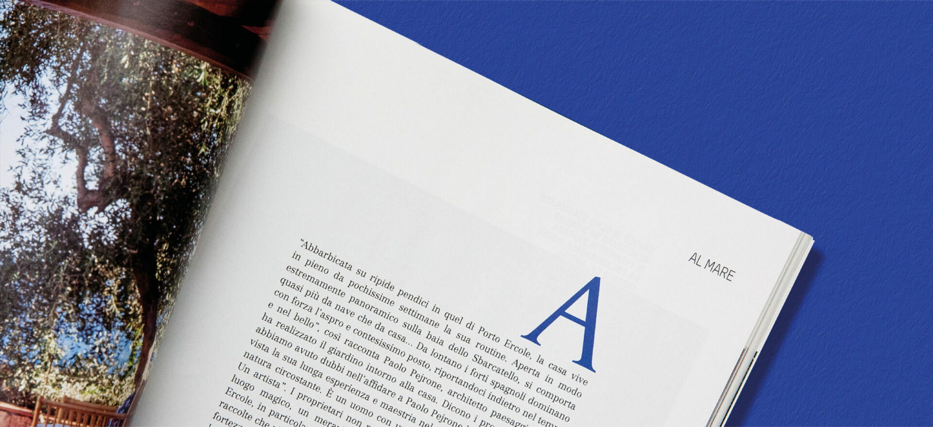
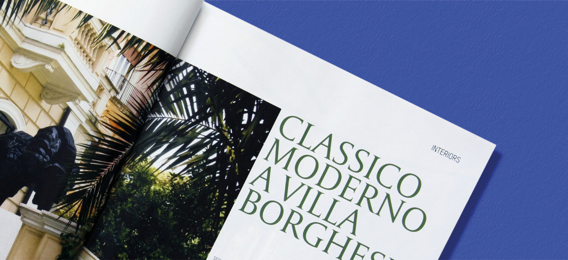
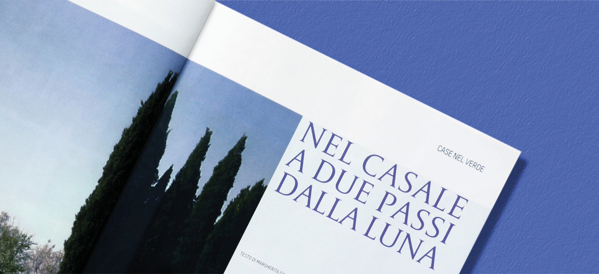
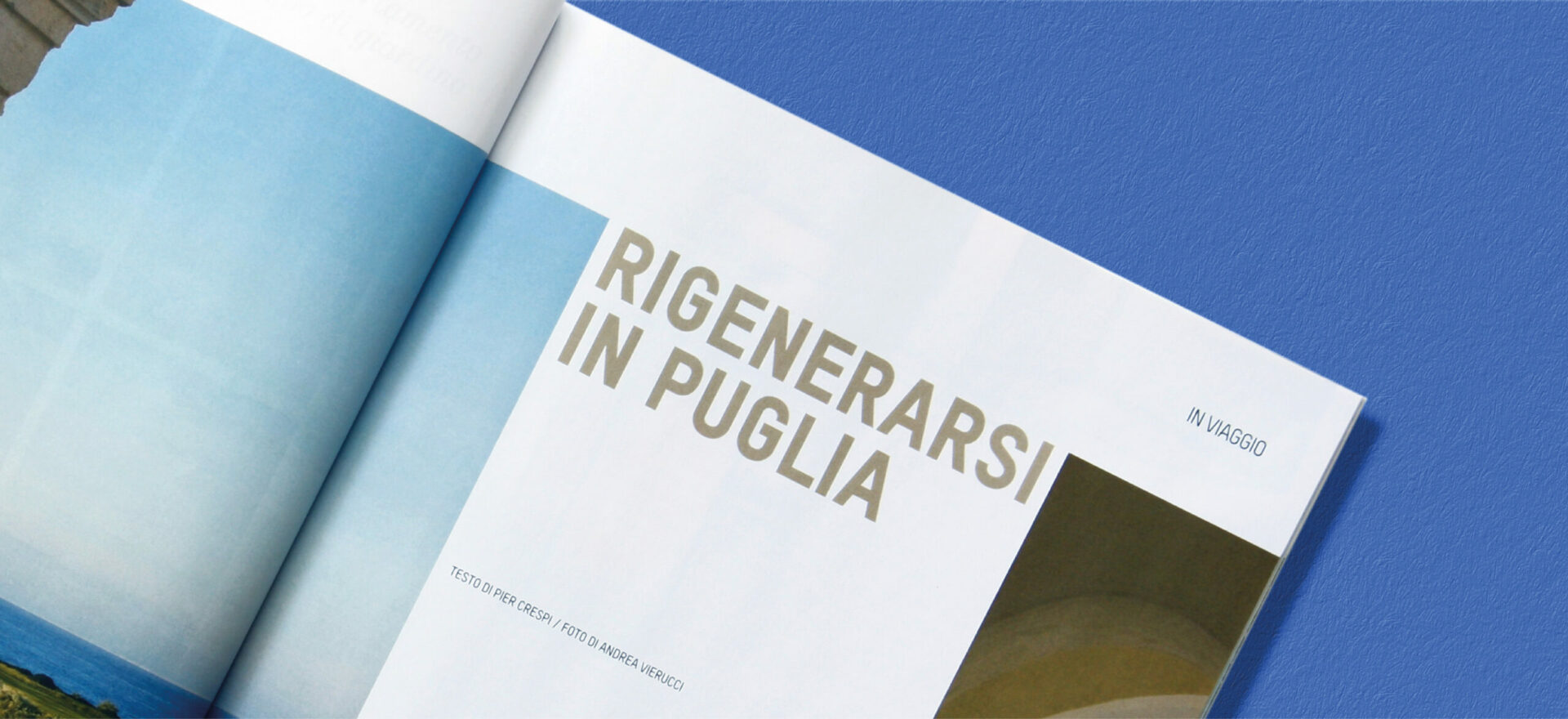
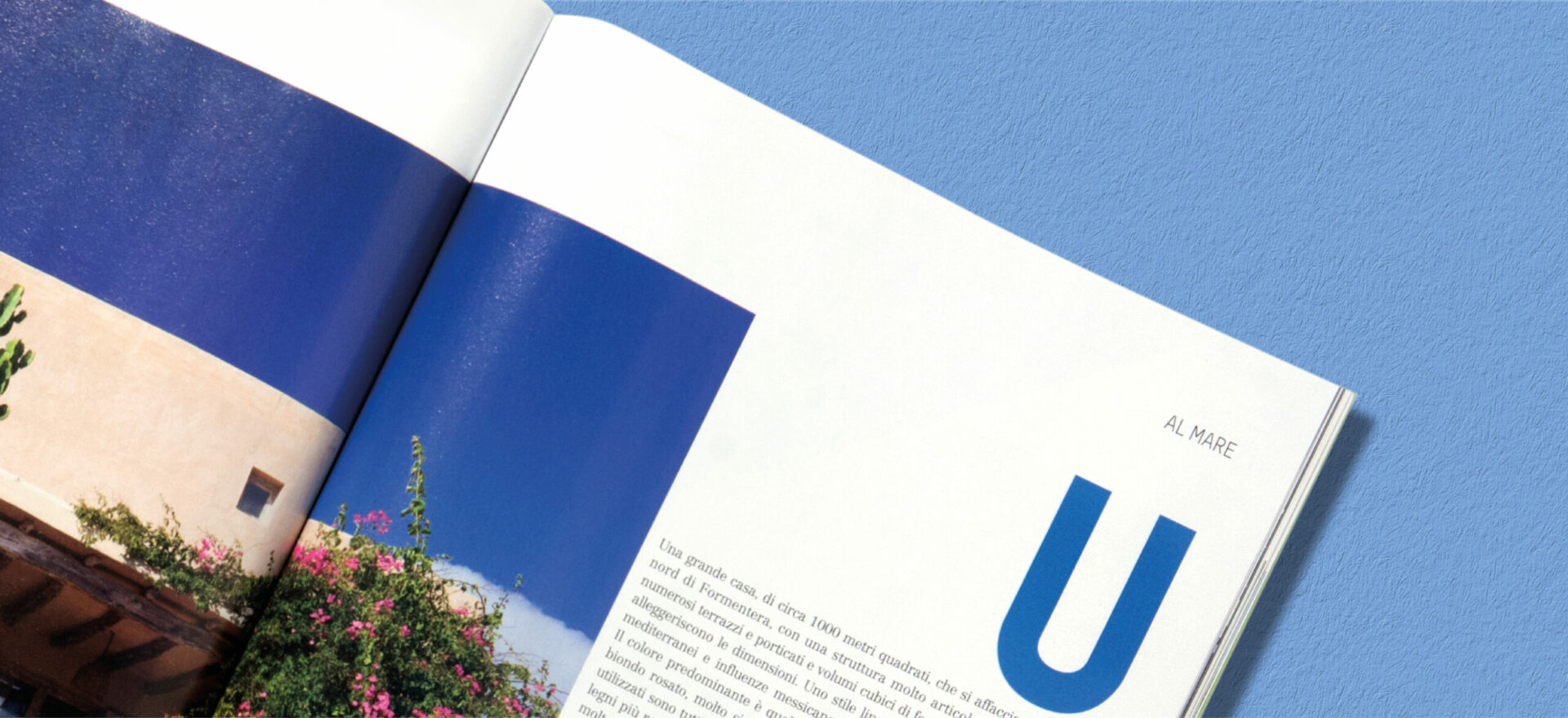
We have redesigned the masthead, treating Villegiardini as a single word, and changing the color for every issue, in relation to the cover photo; we also changed the format, redesigned the graphics, and carried out the art direction for almost 100 issues. The internal part of the magazine has been completely redesigned, with many white portions, large initial letters, simple, spacious layout, and a continuous flow of photographs in every article, as if they were part of an imaginary picture gallery to browse through on a screen.
Results
The magazine has remained popular, though it changed its publisher during the course of the project.
READ LESS ←
